|
Top|製品紹介|会社概要|販売流通 |
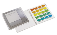
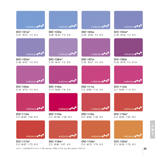
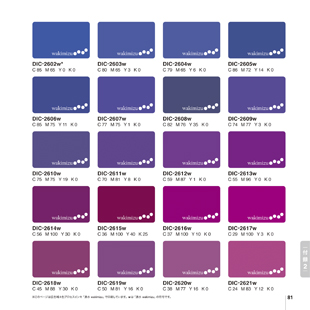
DICカラーガイド プロセスカラーノート |
|||||||||||||||||||||||||||||||||||||||||||||||||||||||||||||||||
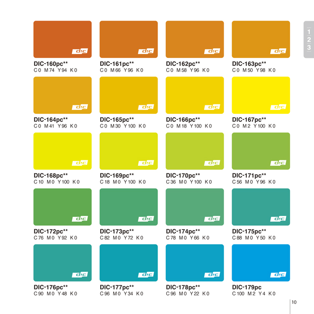
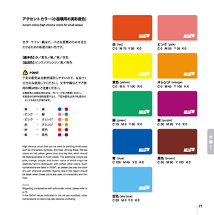
DICプロセスカラーノートは、DICカラーガイド PART1(1・2・3)およびDICカラーガイド PART2(4・5・6)の特色インキ1289色を、標準的なCMYKインキで近似再現した色見本帳です。
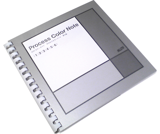 ▲表紙はシルバーのメタルデザイン |
|||||||||||||||||||||||||||||||||||||||||||||||||||||||||||||||||
|
|||||||||||||||||||||||||||||||||||||||||||||||||||||||||||||||||
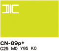
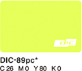
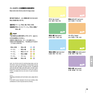
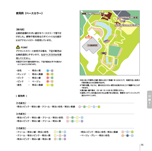
付録1 ユニバーサルデザイン推奨配色セット
カラー化の発達にともない、日常生活に関わる多くのものに鮮やかな色彩やカラフルな配色が用いられるようになりました。しかし、色の見え方には個人差があり、多くの人にとっては見えやすい配色であっても、逆に見えにくく感じる人もいます。そのため、分かりやすくするための色分けが、かえって混乱を招いてしまうというケースも増えてきました。こうした背景から、近年では多様な色覚に配慮した配色やデザインを用いることが、求められています。 DICグループでは、東京大学 伊藤准教授監修のもと、「できるだけ多くの人が等しく認識できる色の組合せ」の開発に取り組んできました。被験者検証を何度も重ね、その一つの成果として、プロセス印刷において情報を色分けして伝えるときに用いる推奨色20色を設定しており、DICプロセスカラーノートでも付録1としてご紹介しております。 With the progress made in color printing and display technology, the great number of products and informations are now painted and presented in many, vivid colors, a situation that was not conceivable even a little while ago. However, colors may appear differently by different individuals, and the colors that are easily distinguishable by many people are difficult for others to distinguish. Thus, colors that are used for conveying information more clearly may instead cause more confusion. With this background, there is a greater need than ever to use color combinations and designs that take into consideration the variations in the color perception of each individual. The DIC Group has engaged in the development of a color pallete that makes the same impression on as many people as possible, under the guidance of The University of Tokyo Associate Professor Kei Ito. We made numerous evaluations of test subjects, and based on these we came up with 20 recommended colors to be used in process printing when information is to be conveyed with different colors. |
|||||||||||||||||||||||||||||||||||||||||||||||||||||||||||||||||
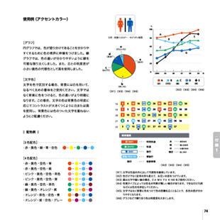
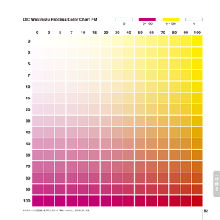
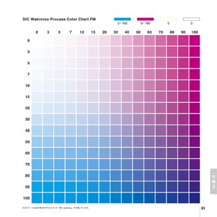
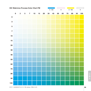
付録2 広色域インキ「DIC湧水」によるカラーチャート
4色プロセスカラー印刷は生産効率の高いカラー印刷に大きく貢献してきました。しかし色再現の範囲には限界があり、ユーザー各位が求める色の要求を充分満たせない場合もあります。また近年では写真原稿のほとんどがデジタルカメラによる撮影となっており、デジタル対応化が進み、CG画像の入稿も増加しています。 Four-color process printing has made a great contribution to high-productivity in color printing. However, the range of colors which can be reproduced by this method is limited, and there are many cases where the color demands of graphic designers are not fully met. These days, the original photographs to be reproduced are almost all digital, and this has spurred development of systems that support digital input. With this progress, the use of CG images in the original materials also is increasing. |
|||||||||||||||||||||||||||||||||||||||||||||||||||||||||||||||||
|株式会社ジーイー企画センター|製品一覧|フォトライブラリー|Dr.TAKEのDTP秘訣集|会社概要|お問い合わせ|sitemap|
|ハレパネ|写真素材の詰めホーダイ|年賀状 素材|級数表|カラーチャート|色見本|PANTONE|素材|素材集|写真素材|
|DICカラーガイド カラーチャート|色見本|DTP印刷書籍|プレゼン材料|プリンタ用紙|版下用紙|